We have had a few customers wanting to show the Mega Menus on desktop only. By default, Divi Mega Menu shows it on desktop and mobile. This tutorial will show you how to hide it on mobile.
Step 1:
Create your Divi Mega Menu in the Divi Engine settings as usual. Here is a link to our documentation on how to set this up.
Step 2:
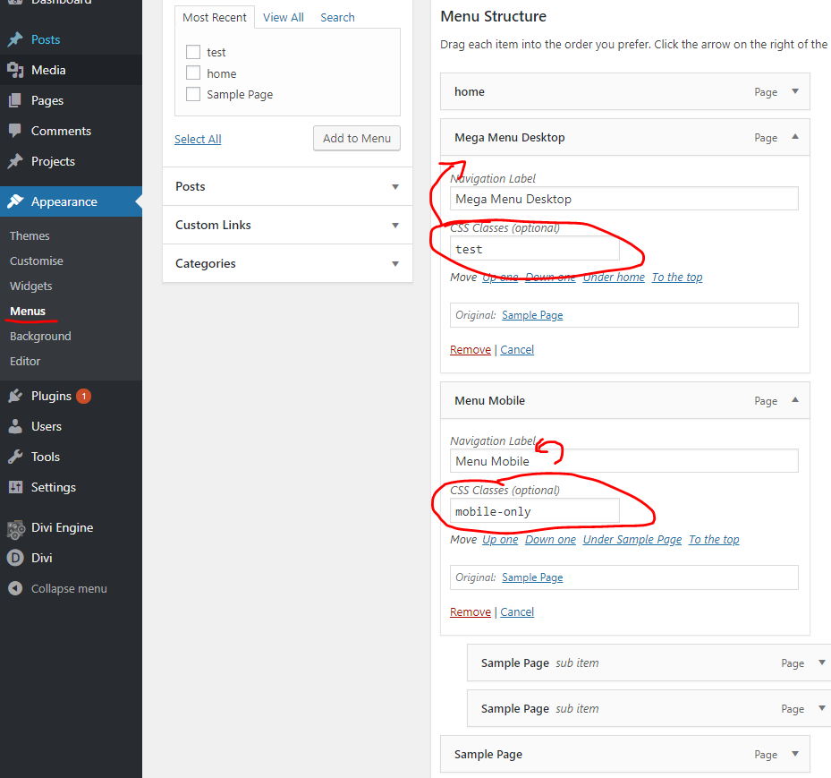
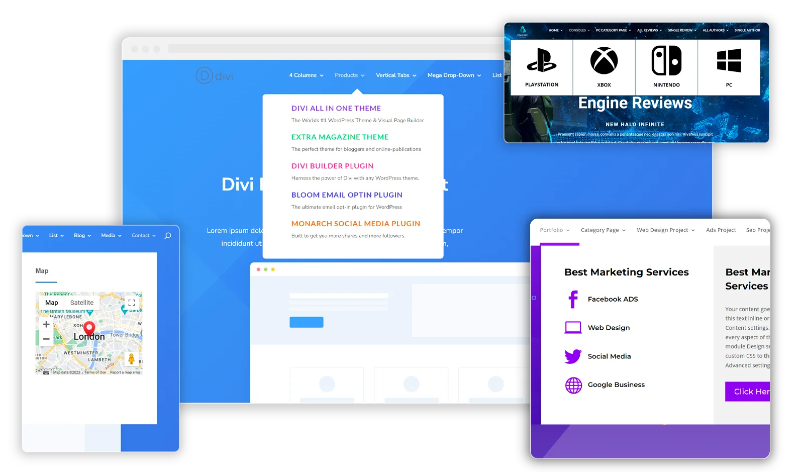
Create two menu items and assign the mega menu custom identifier (CSS class) to the one you want to show for desktop. Assign another custom class to the other that you want to show for mobile. I have added the class “mobile-only” – but it can be anything. See image below. I have labeled the menu items “Mega Menu Desktop” and “Menu Mobile” to be clear on what is happening.
Step 3:
We are doing to add some custom CSS to hide the mobile menu on desktop and hide the desktop on mobile. Below is the CSS and my comments on what each line does.
[css]
.mobile-only {display:none !important;} /*this hides the mobile menu on desktop */
@media all and (max-width: 980px) { /* You can change the breakpoint from 980px to when your mobile menu comes in */
.mobile-only {display:block !important;} /*shows mobile menu on mobile */
.test {display:none !important;} /* hides desktop menu on mobile, make sure you change the word test to be the custom css class you gave for your mega menu */
}
[/css]
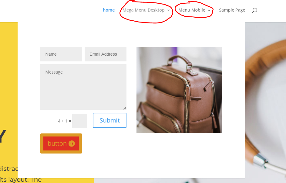
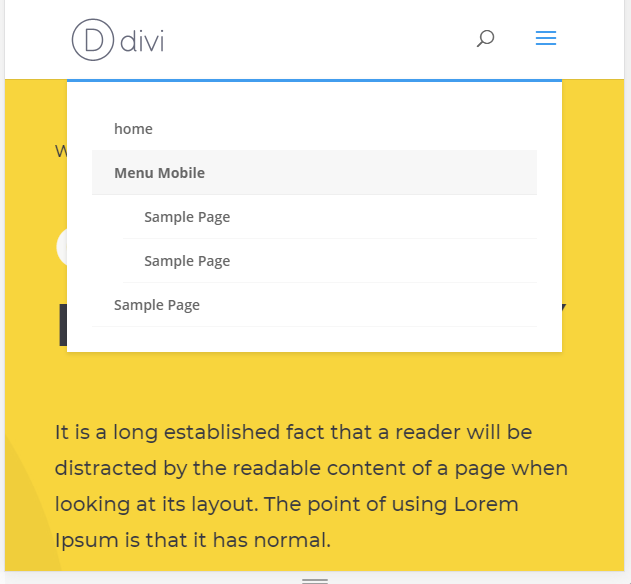
Below is how it looks on the frontend now.


0 Comments